Are you looking for the best ways to create perfect Images for your Amazon Products? What kind of requirements / specs / styles should you use? If you are wondering how your Amazon Product Images can increase CVR & CTR… this blog post is for you!
1. Why are images so important for your Amazon Product?
You got your brand new product from your amazing supplier and you’re ready to list it on Amazon, but you’re not sure how to make the perfect product images for the listing: that might be the case for many of you reading this blog post right now.
…Or maybe you already have your product listing up and running on Amazon, but you know that you could create better images to show how good your product is… you can just feel it, right?
Did you know that humans respond to and process visual data better than any other type of data? We can process visual content 60,000 times faster than text!

Colloquially, we can say that a picture is worth 60,000 words. It’s no wonder that the most incredible advertisements you see in magazines, newspapers, billboards and on social media have little to no text at all.
If this wasn’t enough, you should also know that:
A. 75% of Online Shoppers Rely on Product Photos When Deciding on a Potential Purchase
B. 22% of Returns Occur Because the Product Looks Different when it’s received.
C. Good Visual Content is 40% More Likely to Get Shared on Your Social Accounts.
In the realm of social media & user experience, visual content holds immense power, and in today’s landscape, excelling in visual media is vital for succeeding in eCommerce. Investing in professional product photography goes beyond maintaining a modern and upscale appeal on your listing / store pages.
Consider this perspective: By incorporating the right imagery featuring people throughout your pages and web properties, you increase the likelihood of viewers identifying with your target audience. They may aspire to emulate the looks or experiences showcased by the models using your products.
E-commerce today sells not with words, but with images and video. If you want to up your Amazon game, we strongly encourage you to read this full article on how to create the best Amazon product images and learn how some simple twitches and add-ons to your images can make a real difference in your conversion rate! So, let’s start from the ABC and let’s get down to business!

2. Basic Guidelines & Requirements for Amazon Product Images
Main Image (the one that will appear on the search result):
- The product should fill 85% of your image. This makes sure shoppers on Amazon can recognize what they are purchasing easily.
- Your image ideally should be between 1600 and 10000 px on the longest side. Amazon does allow you to choose 500 px, but a larger image works much better on the zoom function, and customers love that.
- No models allowed. No hands, no writings, no water splashes, etc..
- Noting else than the product is allowed in the main image.
- Background color: only white allowed.

All other images (gallery images)
- Image size: min. 500 pixels in either width or height. Amazon recommends 2560 pixels wide.
- Color mode: Both sRGB and CMYK are accepted.
- File names: file name must include product identifier (Amazon ASIN, JAN, EAN, 13-digit ISBN or UPC)
- Your images must meet one of the following file formats: JPEG, TIFF, GIF. JPEG is the preferred file type of Amazon. You cannot upload animated GIFs.
- Your images should not have any low-quality issues like pixelation or blurriness
- No adult content is allowed (no nudity or anything sexually suggestive)
- If you sell underwear, swimwear, or other skintight clothing, the products must not be freestanding
- None of your photos can include a reference to Amazon, its trademarks, or variations. (no references to prime or Alexa).
- You cannot include any Amazon badges on your photos (ex., Amazon’s Choice, Works with Amazon Alexa, etc.)
3. Image Style Recommendations by Amazon

Always use High-resolution images for your Amazon Products: Ensure that your products are photographed using a professional camera equipped with a high-resolution lens. The images must exhibit high quality, avoiding any blurriness, and effectively convey product details to potential buyers. While capturing product shots, be mindful of the lighting, ensuring it’s neither too bright nor too dull. High-quality product images play a crucial role in helping customers make informed purchasing decisions and establishing trust in your brand.
Image angle: The primary image displayed on the search and product pages, referred to as the ‘main image,’ should consistently showcase the front view of the product. Avoid using the back view as the main image, and instead, use additional images to cover various angles and perspectives, enabling customers to see precisely what they will be purchasing.
Use white background preferably: Always opt for a white background when uploading product images. A white backdrop helps accentuate product features. For white-colored products, consider slightly adjusting the white background tone to create a clear distinction between the product and the backdrop.
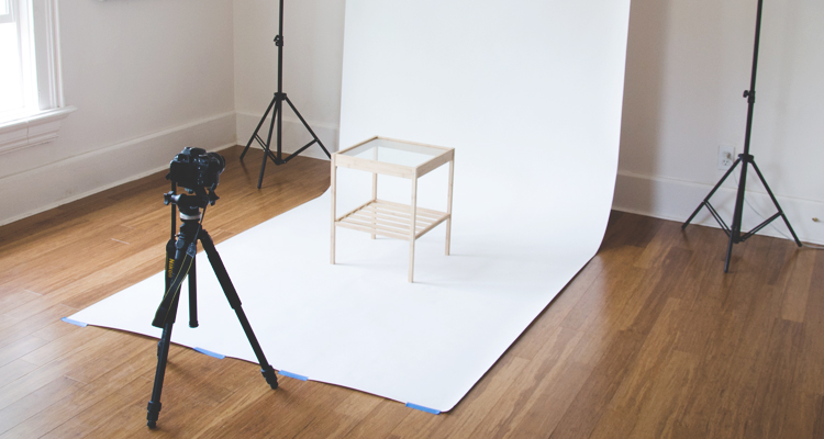
Size Matters: Pay attention to the product size within the image, avoiding extremes of being too large or too small. If the product appears too small, excess white space around it might obscure essential details. Conversely, an excessively large product size could cause some features to be out of focus. Maintaining appropriate aspect ratios of the images is crucial to ensuring a positive customer experience and preventing potential impacts on product ratings.

Now we are ready for some exciting style tips for your Amazon Product Images:
4. Make Sure You Stand Out from the Crowd!
When you are just one of the many listings on the search result page (if you’re good enough to rank on the first page, duh!) how can you make sure you’ll get that precious click?
Rule number one: make sure you stand out! Use all the real estate available in that white square and catch the attention of the user… while still following Amazon’s requirements. A good idea is to tilt / twitch your product in the main image trying to showcase as much as possible of its amazing texture / composition / features.
5. Always Follow Amazon’s Requirements
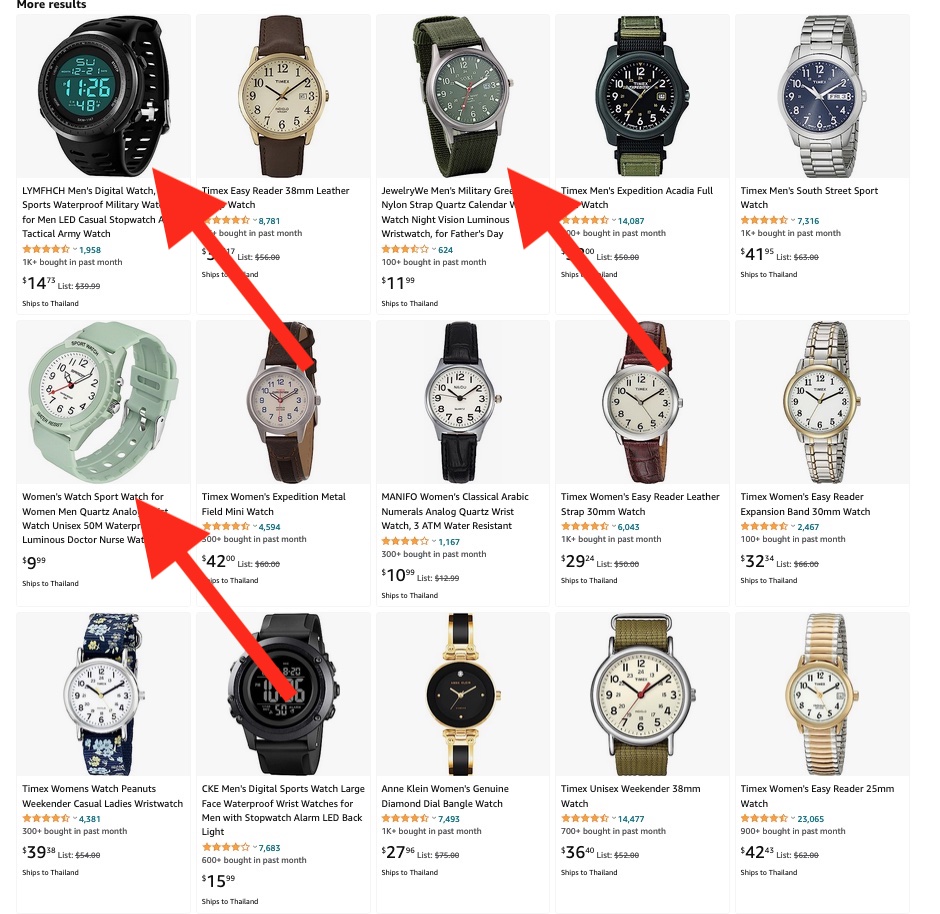
We have listed the requirements above, and we are still impressed with how many sellers do not follow them. It’s not that hard to understand the basic requirement for Amazon main images. Breaking the rules could get your listing (or entire account) suspended. Here’s a few examples:
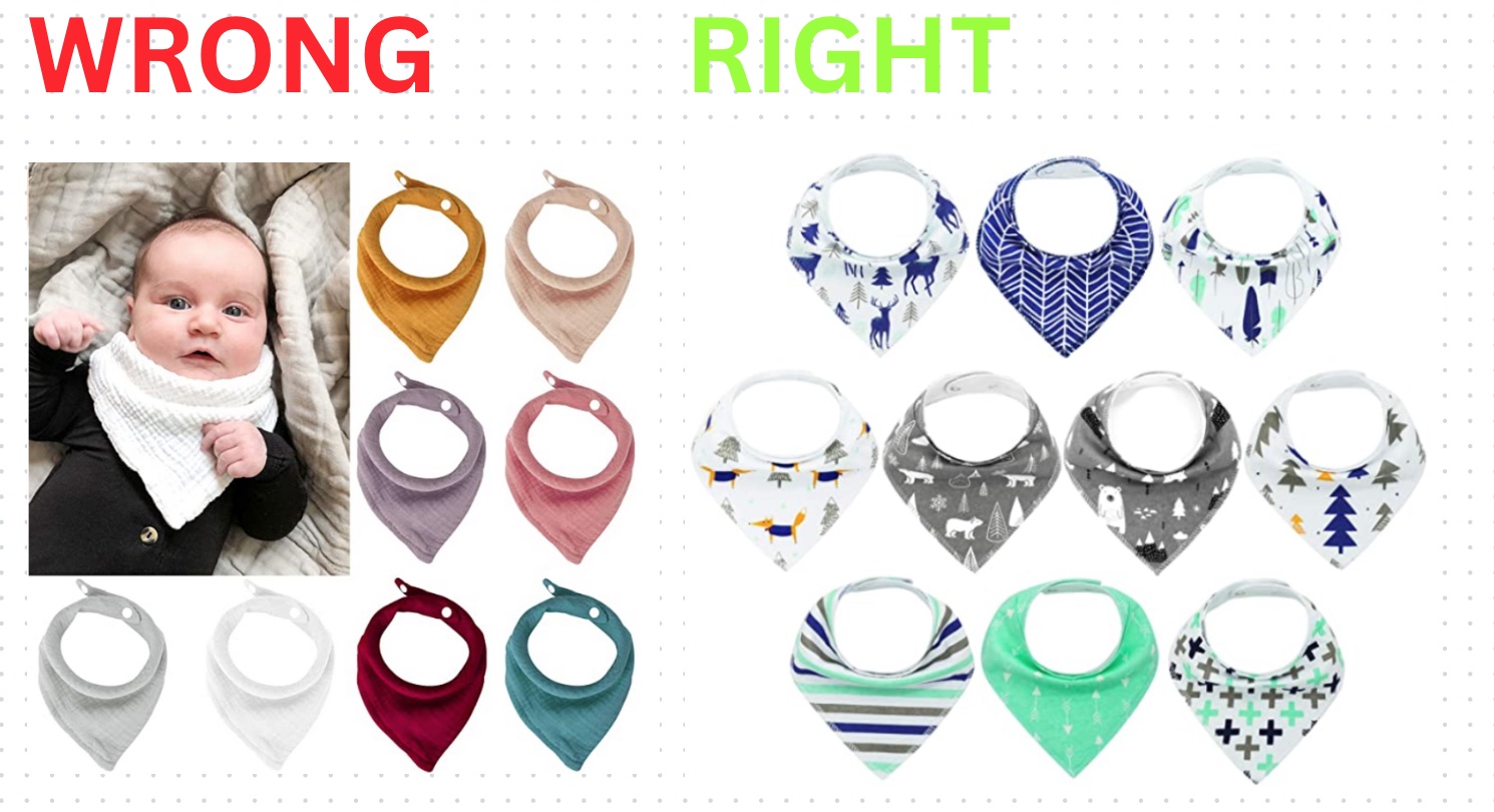
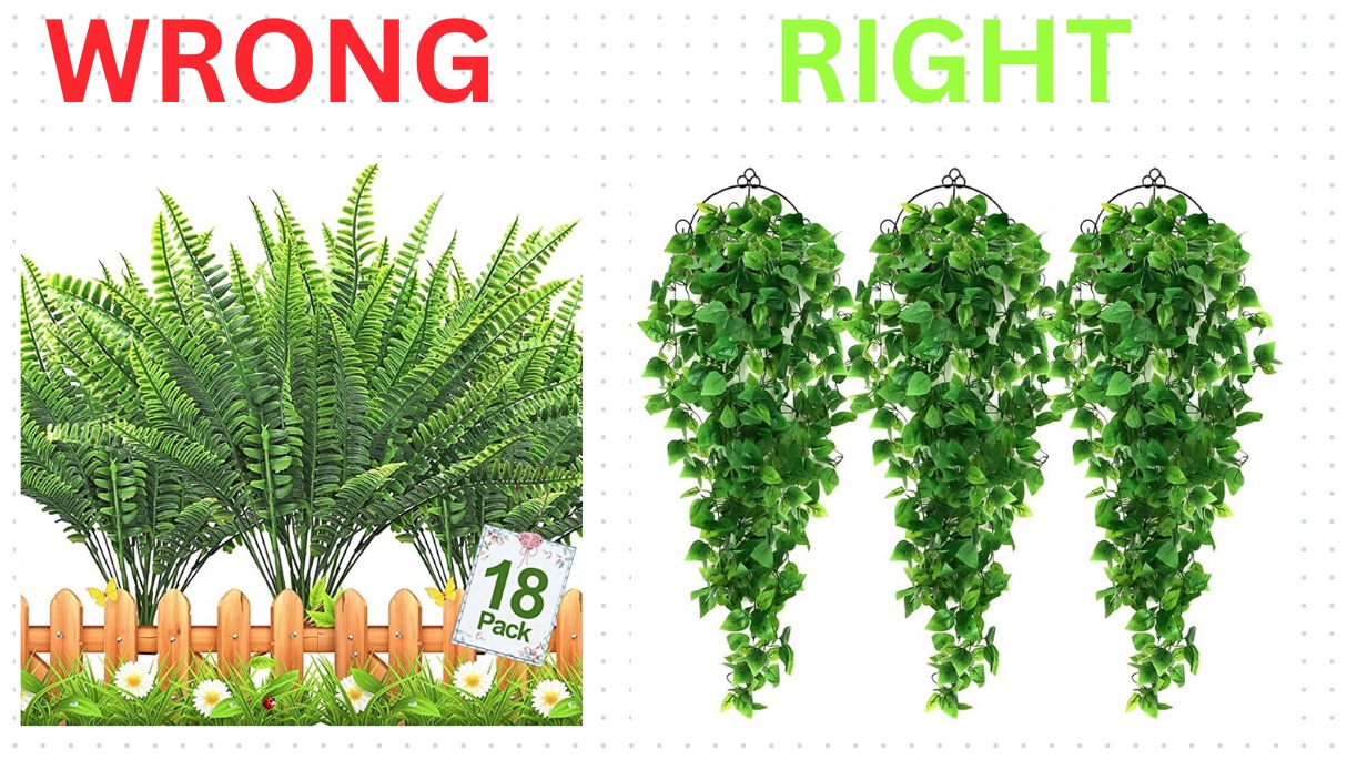
Important thing to keep in mind when choosing product pictures: you do not want to confuse customers. If your product listing is of a remote controlled toy car, your main images should only be of the car and the remote control it comes with. If your main images have the car, the remote and a track, extra wheels and batteries, the customer might think they come as one package. So when the product arrives and the extras aren’t in there, not only are you breaking Amazon’s rules, but the customer will apply for a refund and you might also get a bad review.

6. Use Highly Engaging Images for Your Amazon Products
When is the last time you opened a long-form article with no pictures and actually read it all the way through? If you knew that a product you were searching for online had nothing but paragraphs explaining the product but no pictures – would you buy it? Probably not. Like most people in the digital age, your attention span is short. Most of the times when consumers are searching for something on Google or Amazon, they want it now, not a full minute later. Still a very large part of purchases on Amazon are impulse buy. Images instantly hook the viewer and make whatever they’re reading more “readable.” If you don’t have strong attractive assets to go with your product listings, who’s going to buy your product? No one.

7. Make a Lasting Impact!
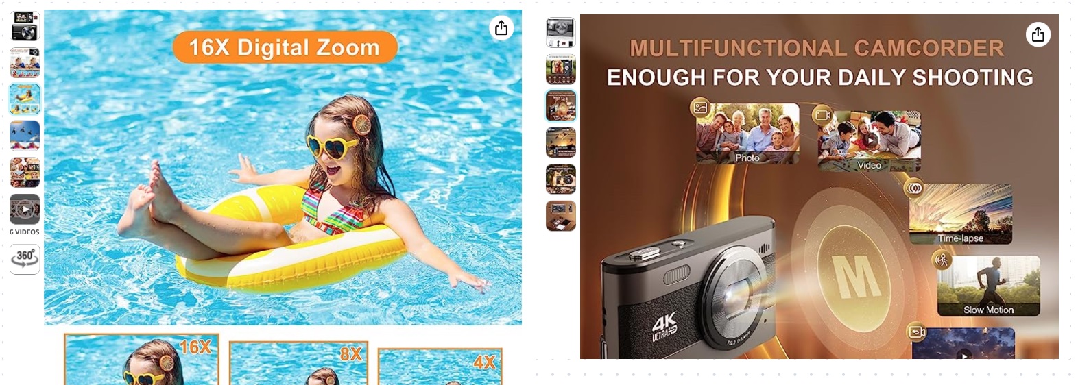
If you use darker colors throughout a gallery of images, someone looking at those images will be left glum and possibly sad. But if you use bright, airy, fun and fresh colors that speak to the wonderfulness of summer or early fall, then you have viewers feeling happy and excited. This is color psychology. Outside of colors, what is in the picture also matters. Is the who and what in the picture leaving people happy or sad? Ultimately, your images should leave a positive feeling!
…Now which one among these 2 product images for cameras on Amazon did it better? Note that the same color mood applies to most of the gallery images.
READ MORE: How to Rank Products on Amazon: Quick Guide & All You Need to Know
8. Work on a Clear IMAGE BRIEFING between Designer, Product Manager, Product Developer & SEO Specialist
Once you’ve got your main image figured out, more opportunities are available through your secondary images. As long as your main image follows Amazon’s rules for it to be featured in search results, you can play with the other images to show product features and unique selling points. This is a chance to show potential buyers why your product is better than the rest.
Having a clear and understandable Image Briefing where all relevant stakeholders are involved and contribute is essential to create perfect gallery images that will:
- Convey a better message
- Increase the chances to sell the product
- Avoid misunderstandings on all ends
- Explain and showcase all the USP (unique selling points) of the product
- Make sure the customers gets what he’s expecting
- Make sure that the listing content goes hand in hand with images and A-Plus content
- There’s no mistakes in specs, details, product measurements and other…
Union makes strength and if there’s one thing that we have learned in so many years of working with hundreds of Amazon Brands for thousands of products… it is that you NEED an image briefing when working between different departments and the more detailed is your image briefing and the better the outcome will be.
9. Shoot Lifestyle Photos with PEOPLE in them for Your Amazon Images
Lifestyle photos are photos that feature a certain type of style of living that helps sell a product that fits your target avatar’s lifestyle. Whether that’s a surfer dude style, a classic mad-men-esque 50s style or athleisure, a lifestyle photo can help the customer imagine the product with themselves in the picture. Feature a person with your product using it in the way it’s intended. For example, if you have a waterproof digital watch, have your model dunk their wrist and the watch in water or have your model go swimming with the watch and snap a picture of the action.
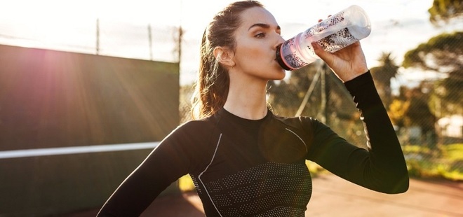
Take for example the picture below. This is a great lifestyle photo that puts the water bottle right in the center. It shows an athletic woman who is outside on a sunny day. Pictures like this help buyers imagine themselves using the product – and that helps to sell the product! Lifestyle images like this are great to have as secondary images.
Here’s another example of a tennis racket. This lifestyle picture shows how the racket looks in a real tennis court. It also shows the relative size of the racket when it is being used.

Don’t have a model? Ask your friends or family! You don’t need a professional model – you only need to be sure you can help buyers imagine themselves using the product. Because Amazon allows nine images, you can get creative and feature other ways your product can be used…. get creative!
10. Make use of Text on Image to explain all the important Image features & details
Yeah, yeah, we know. This post is all about pictures and not words. But! You can use words in your secondary pictures. Adding just a few words or a line in your picture gives you the opportunity to point out the most important features and benefits of your product. You can also include the product size/dimensions/weight, list materials used to make your product to show its quality and sturdiness and, so much more. Show the main features (bullet points) visually on your images. Take for example the picture below.
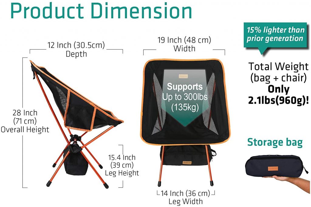
The picture of the lawn chair above provides a lot of helpful information about the product. It shows the chair in different angles and also shows the storage bag that it comes with, showing just how compact and portable the chair is. It also shows the dimensions, which can be important because one size does not fit all. A buyer can see the dimensions and understand if this chair is for them or not. Lastly, on the top right corner, information about the weight is provided in both pounds and grams, helpful for markets like the USA and Canada. In addition, buyers can see that this lawn chair is upgraded as it’s 15% lighter than the previous model. Just don’t go overboard with the text. Keep it simple and to the point. If you add too much text, you’ll bore buyers and your image may not be approved by Amazon. So keep that in mind.
11. Zoom into these Amazing Product Details!
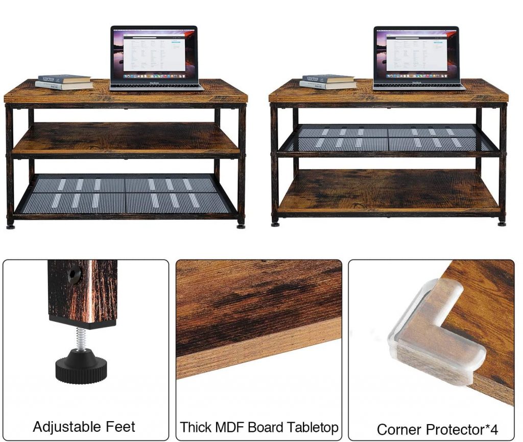
While Amazon lets customers zoom into pictures and get a closer look, it might not be close enough. You have the opportunity to take pictures of your product very closely to show things like texture, material quality, size in comparison to other items and of course, show a new angle. The picture below not only shows a couple of features of the computer desk, but it also zooms in on those features, providing a good idea of the texture of the table as well as the thickness.
12. Make use of Infographics – Instructional photos
If you’ve got the time and creativity, you can include one image that shows how to use the product, and, if your product needs to be assembled, simple instructions on how to assemble it. These little touches can help make customers make a purchase decision. You don’t want a buyer to receive a product and not know how to use it or figure it out easily. Below is an example of an umbrella from a very well reviewed brand on Amazon.
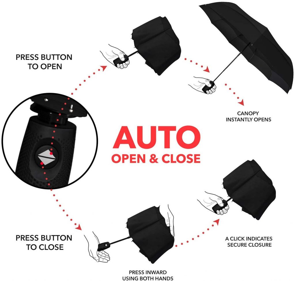
This particular umbrella is marketed as an auto open-close umbrella. It’s a unique feature that is one of the selling points of the umbrella. The picture above shows buyers how the auto open-close function works in an easy to understand infographic. At the same time, it shows where the button to open and close the umbrella is, and what it looks like. Instructional pictures like these as secondary images for your product are always good to have.
13. Comparison with Competitor’s Features
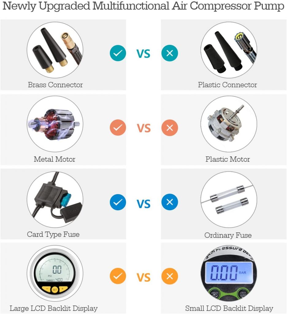
Another great image to add to your list of Amazon product image is a comparison image. A comparison image is where you showcase your product’s top features and benefits versus another product or commonly found features in similar products. This gives you an opportunity to showcase why your product is better than the rest and gives customers the information they need to make an informed decision. In the comparison image below (about an air compressor pump), the featured product’s (on the left) unique features are compared with a generic brand’s (on the right) features.
Show clearly to your potential buyers the reasons WHY they should get your product instead of your competitors’
You can see that the featured product has a better metal connector, a metal motor, an upgraded fuse and a large LCD display, all of which make it a better product than competitor products. Comparisons like this used as one of the secondary images can really make a difference in selling a product. This particular comparison also provides pictures of each feature to help buyers see the difference. A buyer becomes more inclined to buy the your product, which makes clear what unique features are upgraded and better than the competition.
14. Show Your Best Amazon Reviews!
Your product consumers love it? Perfect. Make sure every potential customer is going to see this feedback as soon as possible! Featuring your best reviews and best consumers feedback on your secondary images is a great way of doing it, channeling the attention exactly to where you want.

15. Tip: Editing Secondary Images of your Amazon Listing
As explained above, you now have an idea of how to shoot and choose secondary images. But what if you need to create an infographic, add details and place images within your images? If you have a little graphic design ability, you can use digital software like Adobe Photoshop to edit your photos. And if you’re one of the many who don’t have that skill, you can look to freelance websites like Fiverr and Upwork or even hire a Full Service Agency for Amazon sellers just like us. On these freelance websites, you can find talented graphic designers to help you create the images. For just a few dollars, they can take your image and add information, create infographics, and help polish the pictures you have taken.
16. Tip: Organization of Amazon Product Images

The organization of your product images is important to the listing. How you organize the images can not only get buyers to click, but to continue clicking through your listing and keeping them engaged.
- The first image in the order is of course, your main image. Make sure that it’s an image that shows the product well and follows Amazon’s rules.
- For your second image, it’s a good idea to choose a lifestyle image that shows the product in a real life environment, and possible, use a model to show the product and how it can be used. Using people in your images helps buyers imagine themselves using/being with the product.
- For your third image, you can choose to have another lifestyle image or have a picture showing unique features and perks of the product.
- The fourth and fifth image should show the product in different angles and provide more details and/or you can have a product comparison image.
- On the fifth image you can zoom into these great details, any customer who’s still looking at this point is definitely engaged with your product to a certain level and considering to buy it.
- Pictures six to nine are up to you. It’s always good to continue highlighting product features and have more lifestyle pictures showing how the product is being used. Your first order of images may not always work, so be sure to see how your product listings are performing and change the order of images until you hit the sweet spot.
- Make sure to use all the spots for images and finally to add a product video!
17. Lifestyle Images are More Important Than Your Product Photos… or are they not?!
In various ways, every product is intertwined with lifestyle. And lifestyle images really work well in order to sell products! Buyers have a strong inclination towards viewing products in a lifestyle context. Lifestyle visuals play a crucial role in enabling buyers to imagine themselves with the product, thereby intensifying their desire to make a purchase.
To capture captivating lifestyle images, you can incorporate models and select suitable locations. The choice of background and context should align with the specific product niche, and it is crucial to find the most suitable setting. Even if it requires conducting an outdoor photoshooting to achieve breathtaking images, the effort will undoubtedly prove worthwhile.
…but the final decision depends on your target audience!
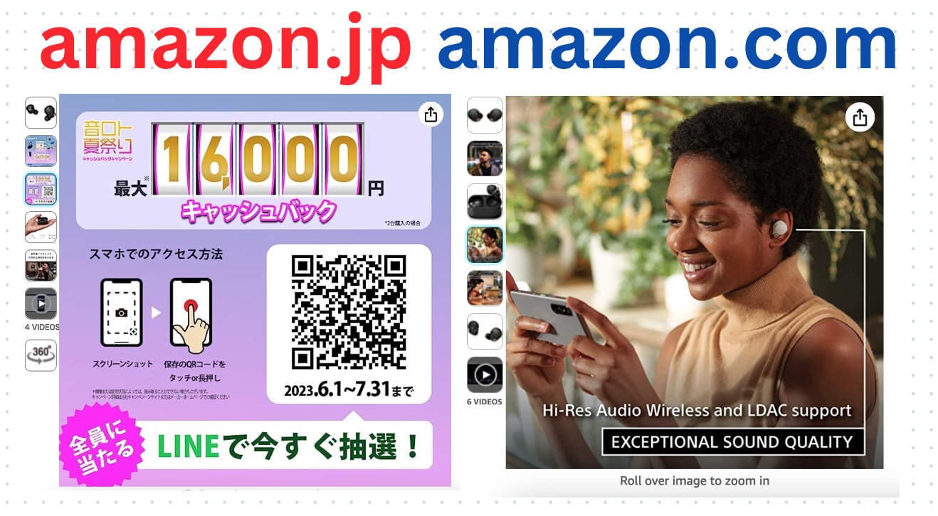
Take a look at the difference in the images for the SAME product in Amazon Japan vs Amazon US:
- 3 out of 6 images in the .com listing are lifestyle images, only 1 in the .jp listing
- The .jp listing images make use of QR code and heavy text presence, that would be impossible to find in the .com listing images
- Text overlaps / integrates in the image in a very different way in these 2 cases
Conclusions
Pictures sell. Pictures will sell your product. People want to get all the information they can quickly and easily. They can get that through images and videos – not through super long product listings that use every keyword imaginable to rank high. Remember to always follow Amazon’s rules for pictures so that you don’t damage your ranking opportunities. It’s important to keep that in mind for your main image and secondary images.
And it’s important to find the best way to use images for your product and for your audience! You will use different kind of images depending on what type of product you are advertising and to what kind of audience you are talking to.
Taking product photos is an experience – a very good learning experience. If you can take sharp, attractive and unique images of your products (showing features, comparisons, dimensions, instructions, etc.) and follow the rules, you will get more customers clicking on your product listings. If you ever wanted to know how to create the best Amazon product images, now you know!






Amazon FBA: Prepare for a Great Q4 (Black Friday, Cyber Monday, Xmas)
[…] will attract and keep people on your product sheet. We even wrote an entire blog post dedicated to Amazon Image Optimization! Adding unique and high-quality visuals to your listings will better explain your product without […]
Learn Amazon Product Photography To Improve Conversion Rates - Leadership Girl
[…] https://wearegrowthhack.com/2021/05/12/best-amazon-product-images-guide-for-fba-sellers/ […]
Get Answer Which Software To Use For Amazon Product Pictures | BUY-TECH-STORE
[…] (8)Create Amazon Product Images that Convert – We Are Growth … […]